Kanjidex: Collect the Kanji!
この記事の日本語版はこちらです。
Last week, I released a new app called “Kanjidex”. In this post, I’ll talk about my goals for the app and reflect on the development process.
You can download it for free Android or iOS.
Introducing Kanjidex
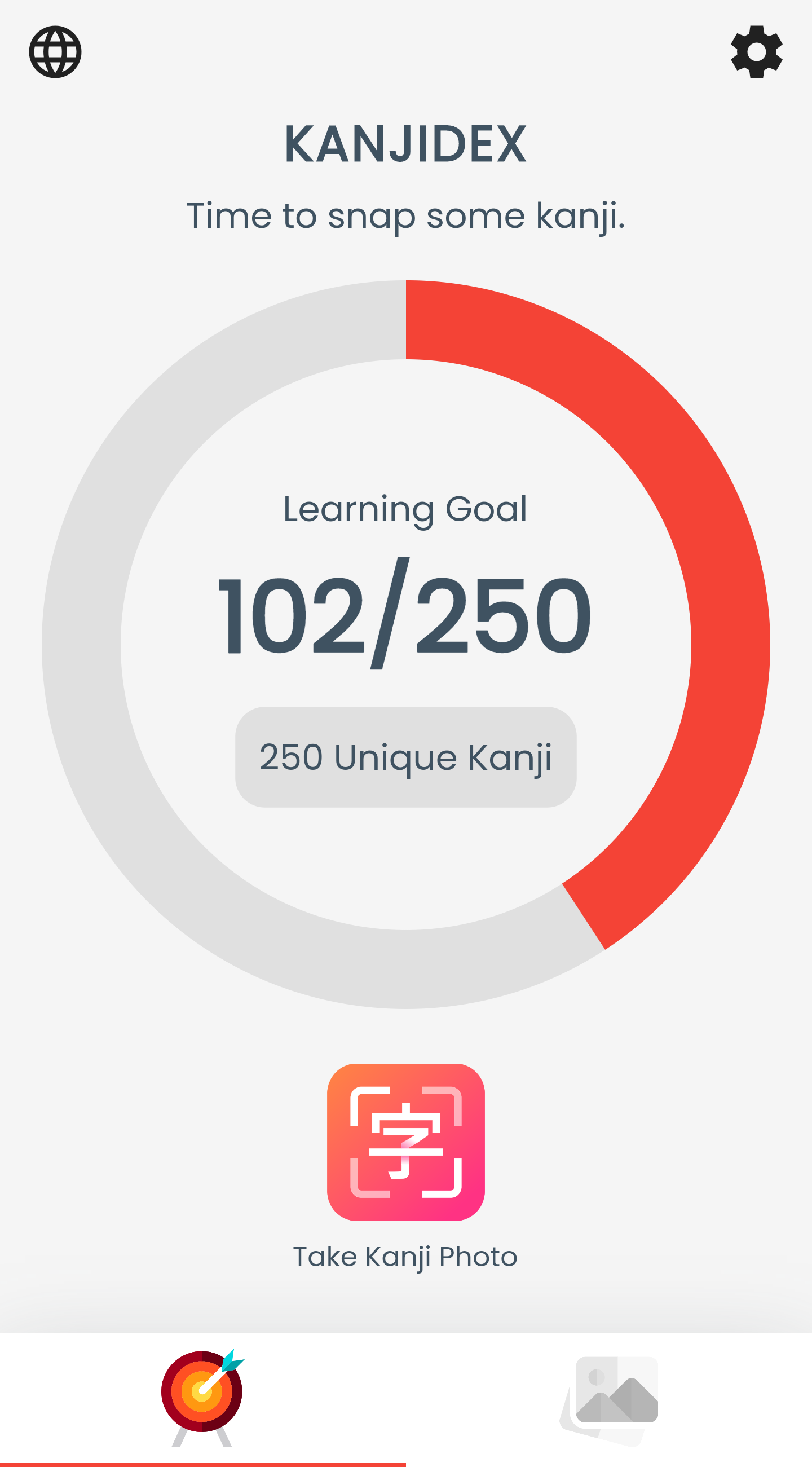
Similar to the famous Pokédex, Kanjidex collects information on kanji you see in the wild. You take a photo, crop out the kanji, and label it. The main screen tracks your progress towards a “learning goal”.
Goals
I had two, simple goals for the app.
- First, I wanted to make an app following the Unix philosophy, “Make each program do one thing well.” This isn’t going to be your home base for kanji study.
- Second, I wanted to make the app paid, or otherwise have a paid feature. My personal goal this year is “to sell something”, and this is my first attempt.
Development Process
Scoping
I started out with just a simple flow/feature list combination. Here’s what it looked like in the very, very early stages:
Tutorial ->
Home ->
  -> Snap Kanji
    -> Take photo
    -> Crop photo
    -> Annotate photo kanji
      -> Kanji entry
        - by keyboard entry
        - by radical
        - by handwriting recognition
      -> Replace existing photo
  -> Kanji Gallery
    -> sort by
      - Genki chapter
      - grade level
      - JLPT level
      - RTK order
  -> Review Kanji (spaced repetition)
    -> Question: location and clozed image
    -> Answer: location, original image, and kanji data
  -> Settings
    -> Reset data
    -> Import data
    -> Export data
    -> Export Anki
    -> Review settings
    -> Review alerts
There are some incredibly difficult features in this list. The implementation of a review system from scratch could take weeks. Handwriting recognition would mean finding or training a model, and then figuring out how to deploy that in a cross-platform way.
I realized how difficult those ideas were from an engineering perspective, and that they probably don’t align with my first goal - to focus the app and therefore simplify it. I opted to throw essentially every feature outside its core purpose: to take and manage photos of kanji.
In doing so, I wound up with a very approachable minimum set of features. After putting together that list, my confidence that I could actually build and release this thing skyrocketed.
Development
I wrote the app in two stages, pre-design and post-design.
I am not a designer, so I decided to purchase an icon and design on Fiverr, a freelancing website. However, freelancers require a lot of instructions, which means you generally have to know what you want. This is an unfortunate chicken-and-egg problem for apps that don’t exist yet.
Naturally, I didn’t really know what I wanted yet, so I opted to first build a feature-complete app with no design. I sent that version’s screenshots along with a requirements document to some designers, and implemented the best design I received.
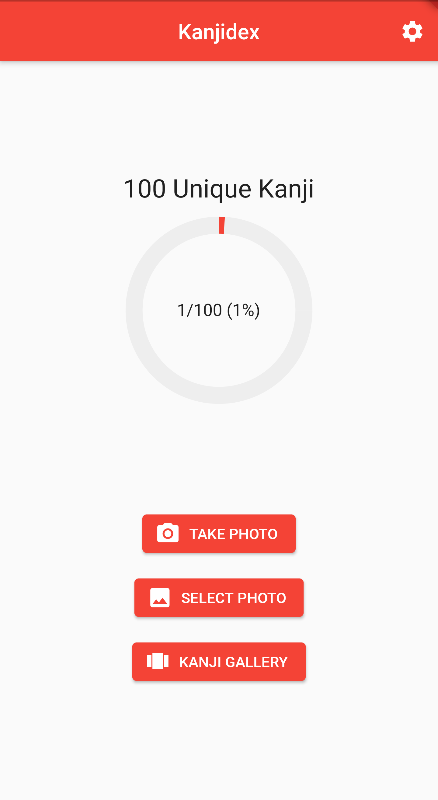
The actual design was even better than what I was able to implement, especially around the indicator. I had to throw out some bells and whistles.
Here’s the home page before and after the design phase:
| Before | After |
|---|---|
 |
 |
Freelancer Costs
I ended up requesting designs and icons from a total of four designers across the world. The total cost for all work done was just under $100. Of course, I only used one of the designers’ home pages and icons.
It was my first time contracting design services. As I didn’t have any favorites to come back to, I felt it was a good idea to be able to compare works. Ultimately it cost me more money, but I now understand approximately how much it costs to get a decent design.
Release
After finishing up the design implementation, I immediately headed to release… as a paid app. This is where I realized the app’s features were too weak to buy outright. Upfront purchase was not the right business model here.
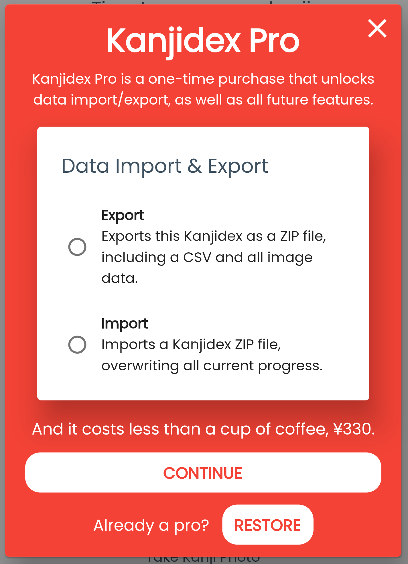
I have never implemented in-app purchases before, but the time was ripe. After “finishing” the app, I went back and implemented a data import/export feature and stuck it behind a “Kanjidex Pro” paywall.
After implementing the in-app purchase, I released the app to both app stores. My friends found some bugs right away, so I had to release a couple times.
Marketing
Once everything was out there, I sent e-mails and texts to all of my friends. But the part that helped the most was reaching out to a teacher at my old Japanese school. She went and posted the app’s link in the school’s Discord, which I believe has powered essentially all the downloads thus far.
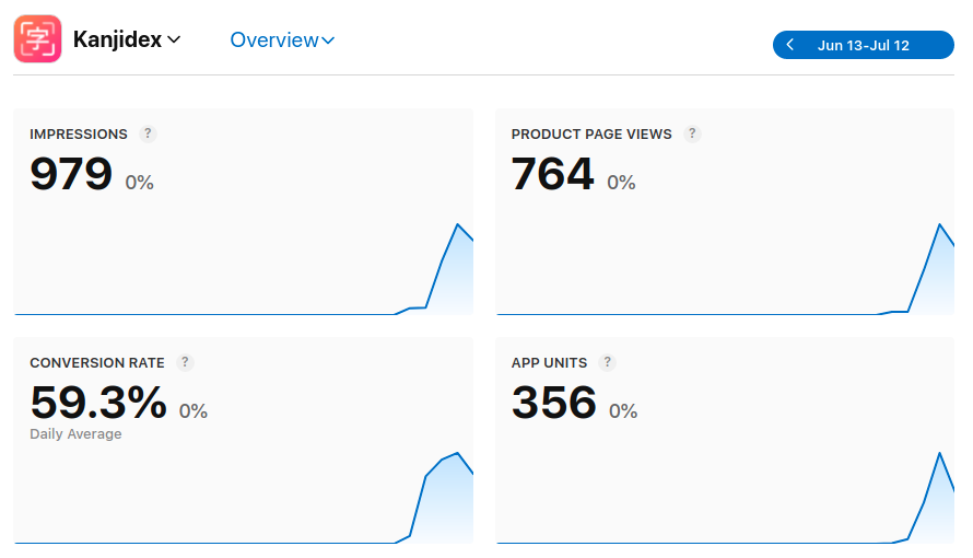
Here’s a snippet of the stats from iOS App Store as of this morning:
Reflection
Kanjidex has about ~500 downloads across both app stores in less than a week. Unfortunately, there are still zero sales.
Given those initial results, here are my thoughts.
- Ultimately, the paid feature is probably just too weak. But I did develop and release an app with in-app purchases, which is going to be an invaluable experience for the next idea.
- The design and icon are amazing, and I’m extremely happy with the quality of work I received from Fiverr. My notion of “what I can build” has expanded dramatically with this project.
- Building the app twice, without and with a design, was absolutely the right move. The designs I received were exactly what the app needed to be. I will be repeating this process in future projects.
I now understand that what I built is actually quite similar to market research. I wanted to test out a core idea, but didn’t have a good way to feel out a need for it. Since I’m an engineer, I had the skills to actually release it in order test its demand.
I will be thinking about my future apps in the same way, only investing further resources if I see the app grow.